What are SlideShare background pictures?
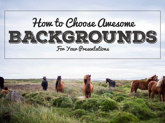 Background pictures are images that fill the entire image of a slide (or PowerPoint presentation). By understanding what makes and what does not make a good background image, you can increase the probability of your audience enjoying your presentation.
People buy largely because of a mood that is created. You can increase the probability of creating the right mood and therefore getting sales by having the right background pictures.
4 tips for choosing the right image

1. White space is incredibly important. If you can find a dead space with no clutter at all, that can be an excellent place to insert your text. There is no clutter to distract the viewer.

2. A blurred area can be an excellent place to insert some of your text. When it is blurred, it does not distract the person from reading the text. If your background pictures do not have blurred areas, sometimes you can use software such as GIMP, PowerPoint or Keynote to take a section out of focus.
Make sure you have enough contrast (color, dark & light) so that the reader does not have to strain his eyes to read the text.

Earn a percentage of the selling price for every book sold.
Click here to learn more.
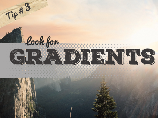
3. Images with gradients can create white space in which to insert your text. A gradient is a directional change in the color or intensity of an image.
Consider the image above. It is easier to read the text in the upper right-hand light areas than in the lower dark areas.
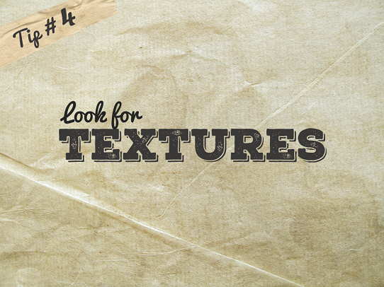
4. Textured images can be excellent background because they are less likely to have meaningful distractions from the text.
Texture King is a good website to find free textures. Another good website is Lost and Taken.
More about background pictures and text
Mobile devices & design
The Forbes website says
It should come as no surprise that more than half of searches begin on a mobile device …. There are several onsite design tactics you should have in place to help facilitate a purchase and offer an excellent user experience. Read more.
Book cover design
The Digital Book World website says
Good cover design is the single most obvious way of making sure your book stands out on the shelf and looks professional. Then it goes on to talk about various design tricks. Read more.
Hottest creative trends in 2016
The Business.com website says
About 93 percent of communication is nonverbal, probably because we process images and visual cues about 60,000 times faster than words.
With millions of users on sites such as Pinterest and Twitter, and Facebook with over a billion active users, the use of visuals becomes even more important. Visuals perform well on social media. Posts with a photo get about 120 percent more engagement on Facebook.
In January, Shutterstock released The Creative Trends Report for 2016. The site took a look at global customer download and search behavior for images, videos and music and found four key trends. Read more.
Infographic with lots of info
On her Google Plus page Danni Wilson says
Over the past week, I have played around with some of the very important factors of my infographic; the text, kurning, spacing, cluster and colour scheme.
At the start of the week, I began to reconsider my layout of the 20 facts….Read more.
Image within text
The River City Graphics YouTube channel says
 In this 60 second tutorial, you will learn how to put an image in Photoshop.
The video goes on to show how to insert an image within text. Watch the video below.
To learn more design secrets, go to the Presentation Panda website.
 Peter Enns has been developing websites since 1996. He is a social media blogger and author of a free YouTube tutorial. It’s called 7 Day YouTube and will teach you how to make entertaining videos & animated GIFs.


