Visitors leaving your page prematurely
When copywriting, be careful that you do not use the wrong words. You do not want your visitors to leave sooner than is necessary.
A WordStream blog post says that they process information subconsciously at lightning speeds to determine if they’ll click or bounce within a few fractions of a second. The post goes on to distill huge amounts of data comparing the results of various words used in copy. It describes why the delinquent words are bad choices.

7 words to avoid when copywriting
1. Submit

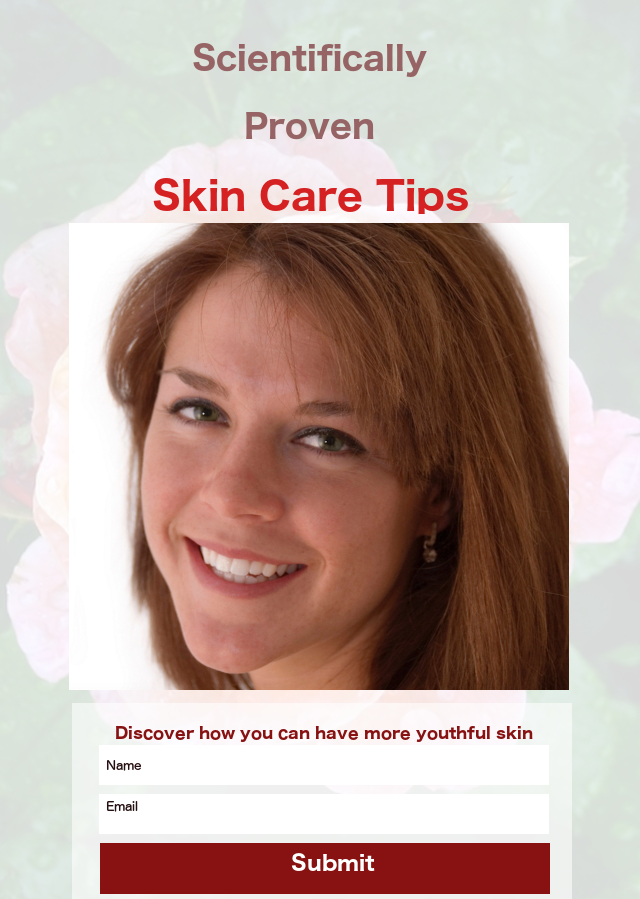
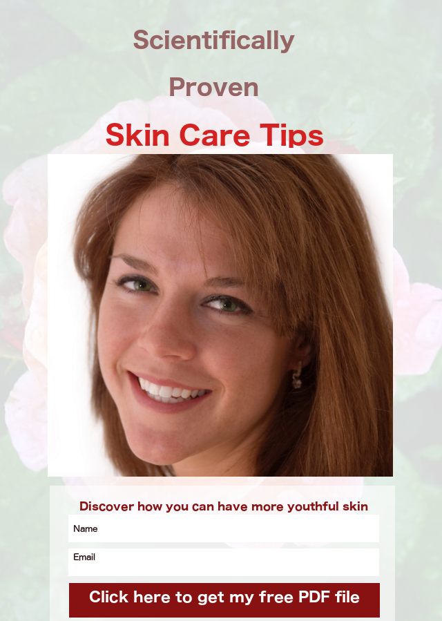
 These 2 landing pages are identical except for one thing. In one the bottom line says Submit. The one on the right says Click here to get my free PDF file.
There was a study using over 40,000 landing pages. One group said submit and the other said something different. The conversion rate for the one with Submit was a little over 14%. The other one had a conversion rate of 17%.
2. Business jargon like synergy
 Simple easy-to-understand English gives a better conversion rate. Read the WordStream blog post for an explanation.
3 Hint of spam
Avoid any words that make people think about being spammed. Even Your information will not be shared gave a noticeably higher CTA (call to action) than We will never spam you.
4. We
People are reading your copy because they want a solution to their problem. They do not care about you as much as they care about their situation. So, use you or else no pronoun.
5. Your
When the message on a submit button was changed from Start your free 30 day trial to Start my free 30 day trial, there was a 90% increase in CTA.
6. Free (under certain circumstances)
The word Free can invite many people who just want a free sample. Read the WordStream blog post for a greater explanation.
7. Save Time & Money
Save Time & Money is a vague, meaningless, overly-used generic phrase.
Understand those 7 points
To get a thorough understanding of those 7 points and their implications when copywriting, read the article entitled 7 Conversion-sabotaging Words to Avoid at All Costs.
Sample squeeze page
Below is a mockup of a sample squeeze page. As you can see, it is very simple. Remember, more is less. It has
- An eye-catching headline that makes people want to read more.
- A few pictures to help tell the story.
- A minimum amount of text to tell the story.
- A place for the visitor to leave their name & email address.
Click on the graphic now.

